I build data visualizations
about science and health.
I have a Master of Public Health (University of Minnesota), a degree in graphic communication design (University of Westminster, First Class Honors), and expertise in R, Python, JavaScript, and D3.
I've worked in public health consulting at ICF, vaccine distribution at the Minnesota Department of Health, and rapid diagnostic development at the University of Minnesota. I also founded tcplot, the Twin Cities data visualization community.
Data Visualization Projects
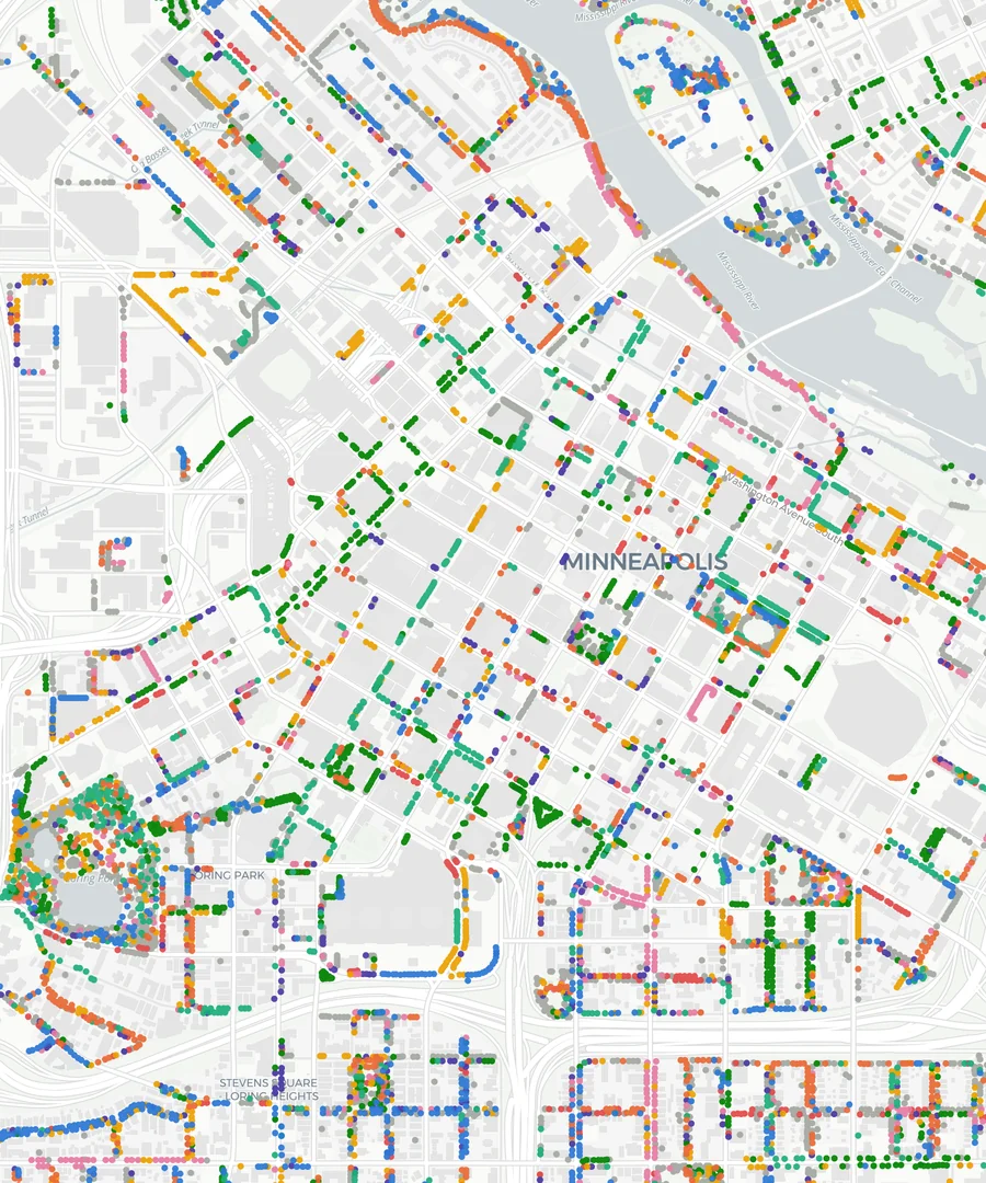 Minneapolis Trees
 Two hundred sixty-eight thousand public trees on one map, colored by genus and filterable by species, planting year, location, root stock and program. The streets are the trees.
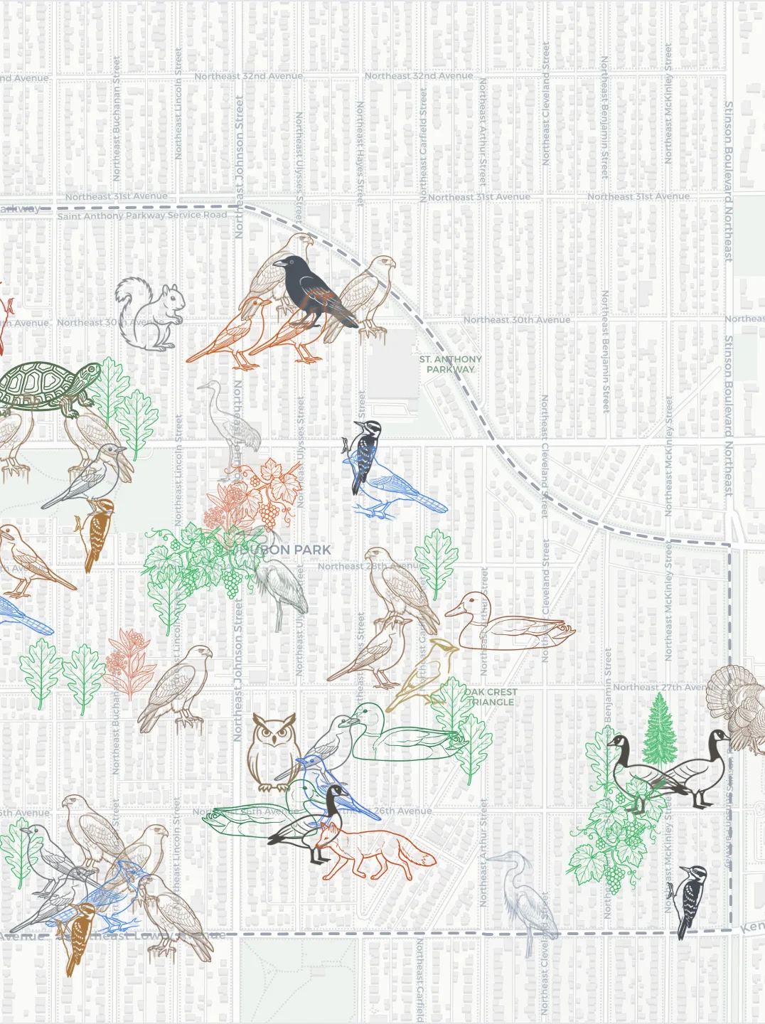 Nonhuman Neighbors
 Every species recorded in one Northeast Minneapolis neighborhood, each drawn as line art of the organism itself and tinted its own color, chickadees to slime molds.
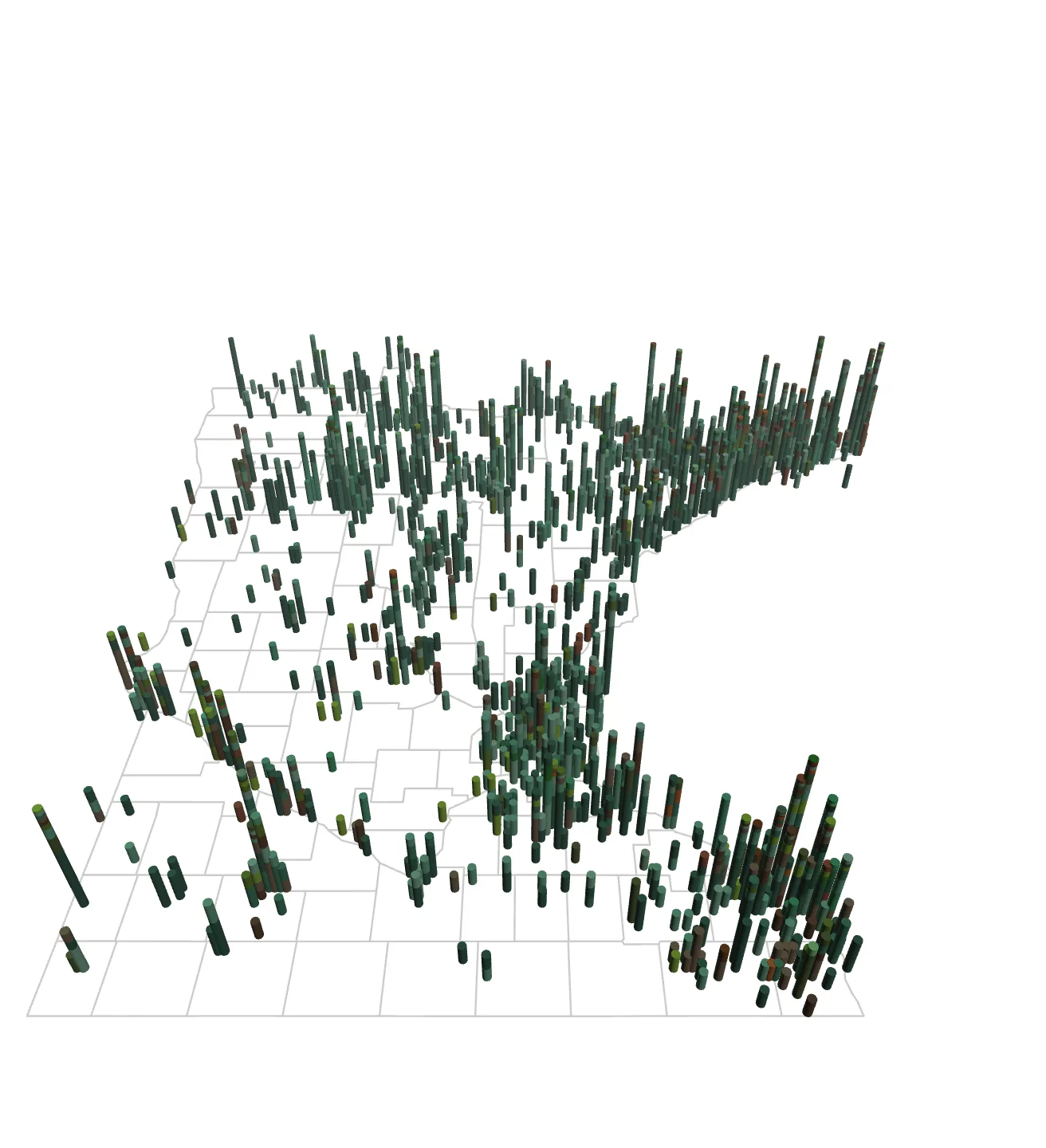 Minnesota Mosses
 A century of moss observations built into a 3D map you can turn in your hands. Bar height is how much was recorded, and the stacked colors are taxonomic orders.
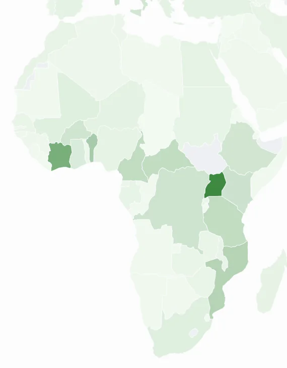 Mosquitoes, Malaria & Sickle Cell
 A scrolling atlas of how mosquito range, malaria burden and sickle cell trait fall across the same ground, and the evolutionary pressure that links them.
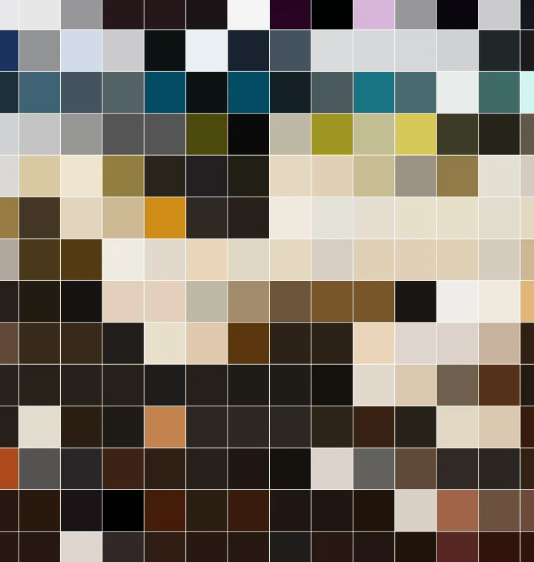 The Met Collection
 Explore the Metropolitan Museum of Art collections.
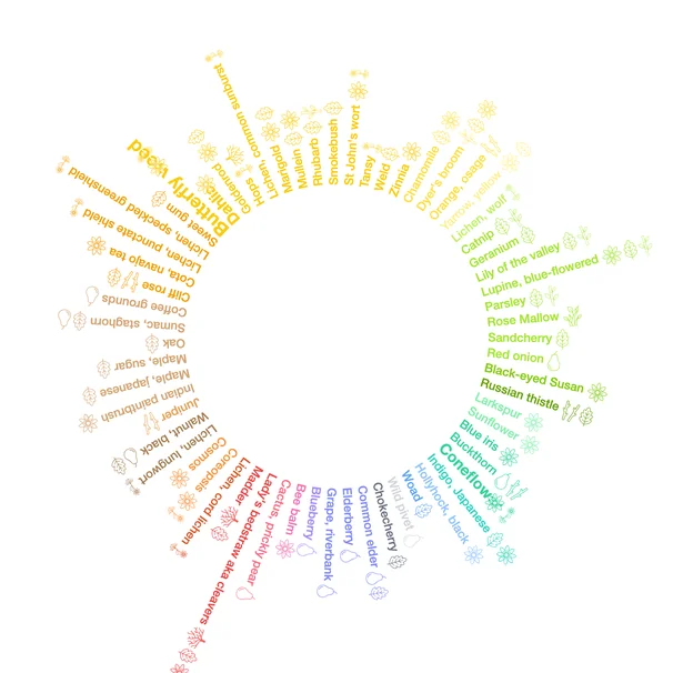 Wild Dye Plants
 A radial index of plants that yield dye, arranged by the color each one gives up.
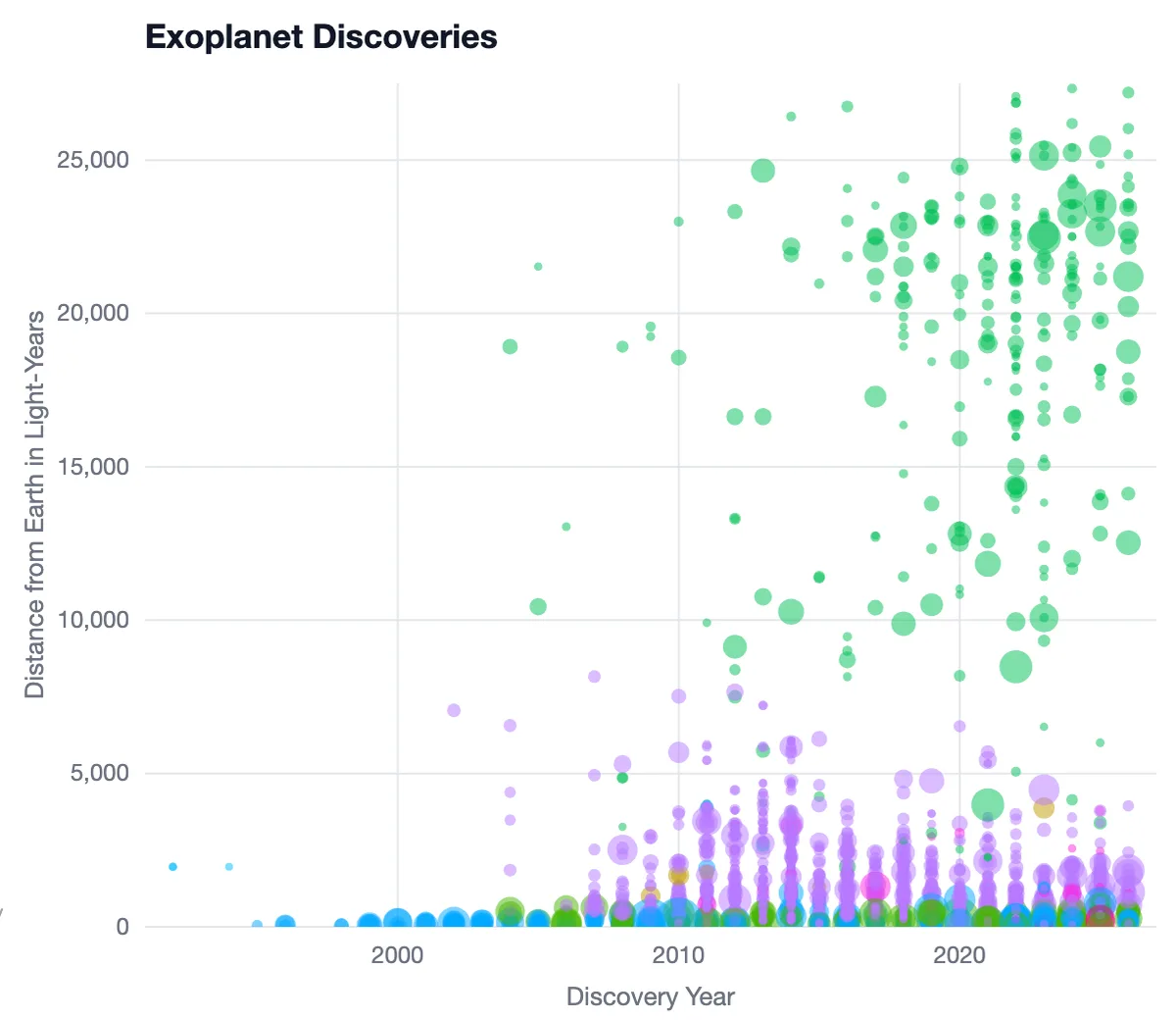 Exoplanet Discoveries
 Every confirmed exoplanet by distance, mass and the method that found it, showing how detection has reached steadily farther from Earth.
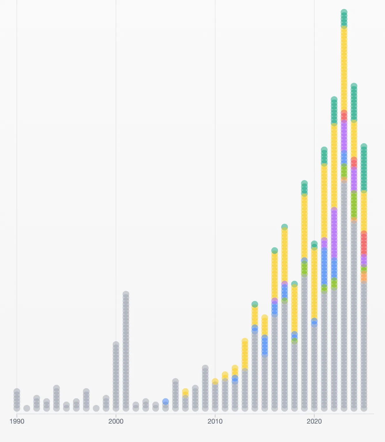 AI Models Timeline
 Notable AI models year by year from Epoch AI data, colored by the organization that trained them.
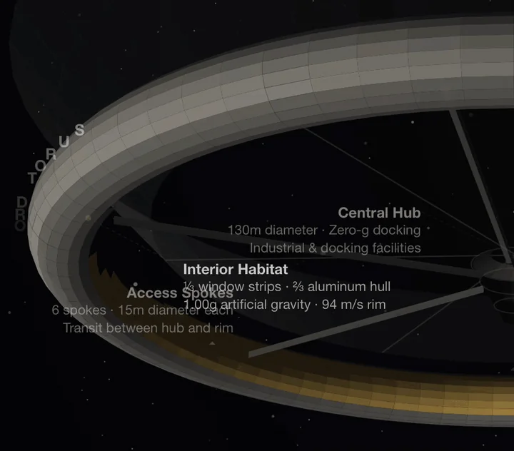 Stanford Torus Explorer
 A parametric walk through the 1975 NASA design for a rotating space colony, at true scale and adjustable.
 Global Tuberculosis
 Estimated incidence, detected cases and deaths for every country from 2000 onward, drawn from WHO program data.
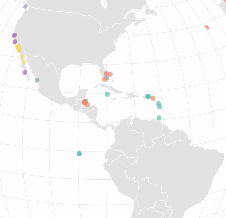 Octo-
Octo-puses
Where octopus species have been observed worldwide, species by species across a quarter century of records.
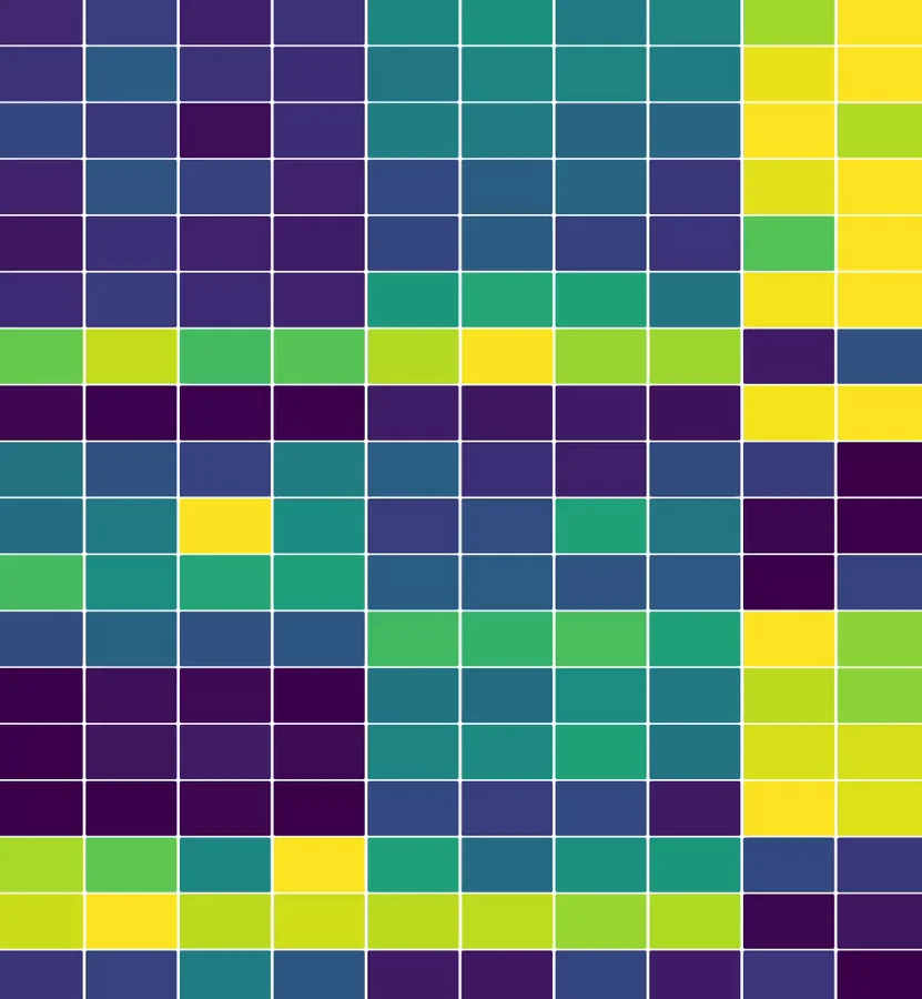 Medical Expenditure Panel Survey
 Healthcare use, spending and insurance coverage across American households, normalized so variables measured in different units can be read side by side.
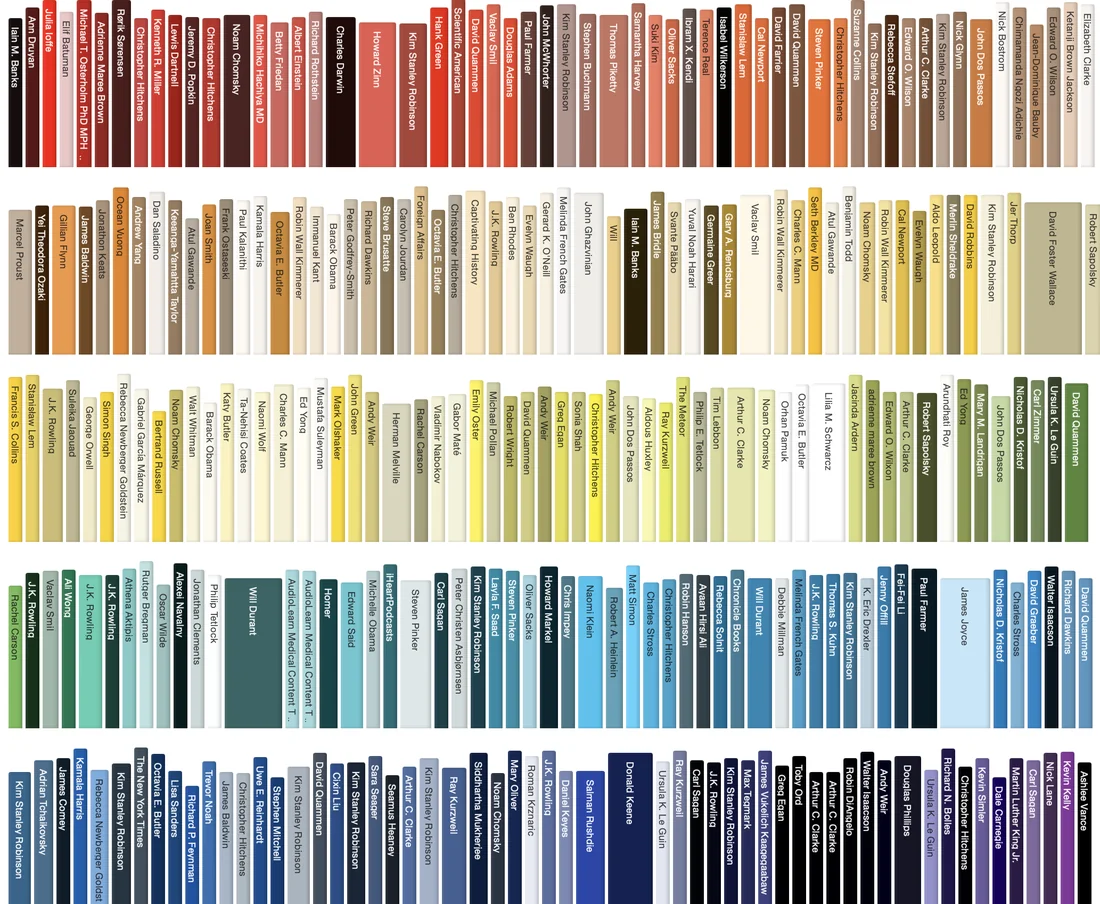 Audiobooks
 An Audible library as one long bookshelf: every spine colored from its cover art, its thickness the book's length, its height the year of release.